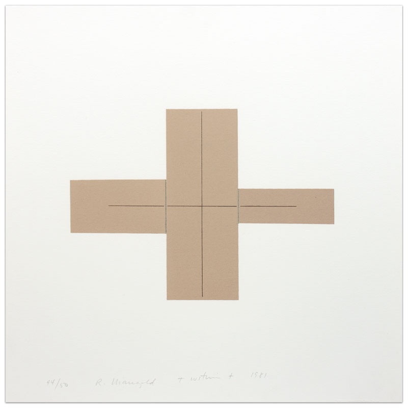
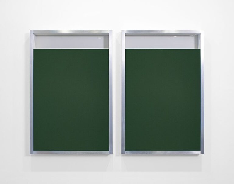
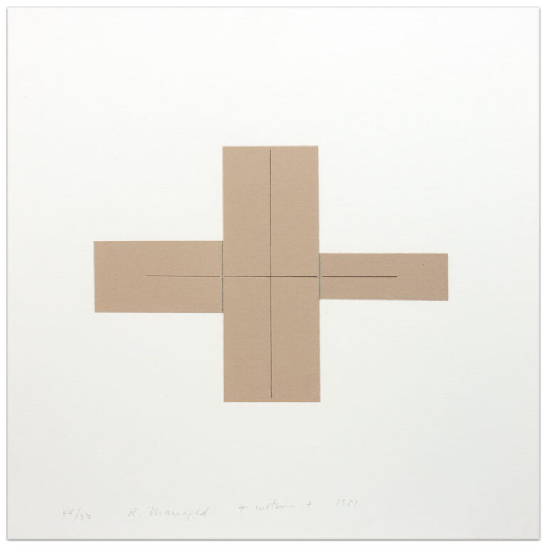
International Fine Print Dealers Association (IFPDA), Fine Art Print Fair (online only) 2020
October 7, 2020 – November 1, 2020
Works In Exhibition
+ Within + [linear + bisecting four colored rectangles in a + formation]
Image size irregular: 7 15/16 x 10 15/16 inches (20.2 x 27.8 cm)
Paper size: 16 1/2 x 16 1/2 inches (41.9 x 41.9 cm)
Edition of 50
Signed, numbered, titled and dated along lower edge in graphite
(Inventory #28680)
Information Request

Information Request (Inquiry)

Image size irregular: 7 15/16 x 10 15/16 inches (20.2 x 27.8 cm)
Paper size: 16 1/2 x 16 1/2 inches (41.9 x 41.9 cm)
Edition of 50
Signed, numbered, titled and dated along lower edge in graphite
(Inventory #28680)
The Hydraulic Door Check
Image size approx.: 8 1/2 x 15 inches (21.6 x 38.1 cm)
Paper size: 17 1/4 x 23 3/4 inches (43.8 x 60.3 cm)
Edition of 55, 15 AP
Signed lower right and numbered lower right in ink
(Inventory #30888)

Image size approx.: 8 1/2 x 15 inches (21.6 x 38.1 cm)
Paper size: 17 1/4 x 23 3/4 inches (43.8 x 60.3 cm)
Edition of 55, 15 AP
Signed lower right and numbered lower right in ink
(Inventory #30888)
River
Image/paper size: 11 1/2 x 8 inches (29.2 x 20.3 cm)
Signed and dated lower right in graphite
(Inventory #31166)

Image/paper size: 11 1/2 x 8 inches (29.2 x 20.3 cm)
Signed and dated lower right in graphite
(Inventory #31166)
Leaning on Air
Image size: 8 1/2 x 27 3/8 inches (21.7 x 69.5 cm)
Paper size: 11 1/2 x 30 inches (29.5 x 76.5 cm)
Edition of 18
Signed and numbered
(Inventory #32432)
Information Request

Information Request (Inquiry)
Image size: 8 1/2 x 27 3/8 inches (21.7 x 69.5 cm)
Paper size: 11 1/2 x 30 inches (29.5 x 76.5 cm)
Edition of 18
Signed and numbered
(Inventory #32432)

Image size: 8 1/2 x 27 3/8 inches (21.7 x 69.5 cm)
Paper size: 11 1/2 x 30 inches (29.5 x 76.5 cm)
Edition of 18
Signed and numbered
(Inventory #32432)

Image size: 8 1/2 x 27 3/8 inches (21.7 x 69.5 cm)
Paper size: 11 1/2 x 30 inches (29.5 x 76.5 cm)
Edition of 18
Signed and numbered
(Inventory #32432)
Turquoise Mirrorpiece
Edition of 15
30 x 30 inches (76.2 x 76.2 cm)
Signed and numbered
(Inventory #31686)
Known as one of the founders of Conceptual Art, Robert Barry, in the 1960’s and 1970’s explored sound waves, barely visible string, releasing inert gas into the atmosphere and announcing that exhibitions would be closed. The projects engaged issues of audience involvement, perception, spatial relationships and art world structures. Early on, Barry used written language as art, counter-point and explanation for his work. The use of language soon became his ‘signature’ medium. Barry’s works are, in one sense, austere. Clean words and surfaces provide visual allure. Reading the chosen words provides an opportunity to get into the works and to better “read” the art. However, no defined references exist in the works. One must be willing to question and explore the potential connections, both for the artist, but more so for the viewer. Each of the formal decisions Barry makes provides opportunities for more specific readings of the work, yet there is no one narrative or reference to be made. How the artist makes work that is powerful to look at, captivating to read in their specificity, introspective to explore and yet wide open, is a big part of why the work is so strong.
In the brand new “Turquoise Mirrorpiece”, Barry has dispersed words across, over and beyond the surface. The arrangements, juxtapositions, and proximities of the words give further opportunity not only to read the words but to read INTO the words, so as to think about what the relationships may be. The smooth quality of the glass reflects imagery and colors in the space, as well as reversing, repeating and spotlighting various elements of the room. How much is on purpose and how much is open to chance is forever unknown. The known, the unknown and the grey area between are key to equally examine in Barry’s work. In order to do this, one must also equally examine the general, the personal and the universal.
Barry’s first solo museum exhibition was in 1971 at The Tate in London and over the years he has proceeded to have solo exhibitions at the Stedelijk in Amsterdam, the Folkwangmuseum Essen in Germany, the former Museum of Conceptual Art in San Francisco, the Musée St. Pierre, Art Contemporain in Lyon, France, the Haags Gemeentemuseum in Den Haag, Netherlands, the Dum Umeni Brno in the Czech Republic, and the Kunsthalle Nurnberg among others. Group exhibitions with Barry’s work have taken place at the Guggenheim Museum in New York, Seattle Art Museum, Jewish Museum, Kyoto Museum of Fine Arts, Museum of Modern Art in New York, among hundreds of others. His works are in the collections of the Whitney Museum of American Art, New York, NY, Van Abbemuseum, Eindhoven, Stedelijk Museum, Amsterdam, Panza Collection, Varese, Ludwig Collection, Cologne, Museum of Modern Art, New York, Hirshorn Museum and Sculpture Garden, Washington D.C., Musee National d’Art Moderne, Centre George Pompidou, Paris, Kunstmuseum Basel, Basel, National Gallery of Art, Washington, D.C., The Solomon R. Guggenheim Museum, New York, Museum für Monderne Kunst Frankfurt am Main, Frankfurt, Germany, Museum of Contemporary Art Los Angeles, Los Angeles, and the Musée d’Orsay, Paris, among many others.
Information Request

Information Request (Inquiry)
Edition of 15
30 x 30 inches (76.2 x 76.2 cm)
Signed and numbered
(Inventory #31686)
Known as one of the founders of Conceptual Art, Robert Barry, in the 1960’s and 1970’s explored sound waves, barely visible string, releasing inert gas into the atmosphere and announcing that exhibitions would be closed. The projects engaged issues of audience involvement, perception, spatial relationships and art world structures. Early on, Barry used written language as art, counter-point and explanation for his work. The use of language soon became his ‘signature’ medium. Barry’s works are, in one sense, austere. Clean words and surfaces provide visual allure. Reading the chosen words provides an opportunity to get into the works and to better “read” the art. However, no defined references exist in the works. One must be willing to question and explore the potential connections, both for the artist, but more so for the viewer. Each of the formal decisions Barry makes provides opportunities for more specific readings of the work, yet there is no one narrative or reference to be made. How the artist makes work that is powerful to look at, captivating to read in their specificity, introspective to explore and yet wide open, is a big part of why the work is so strong.
In the brand new “Turquoise Mirrorpiece”, Barry has dispersed words across, over and beyond the surface. The arrangements, juxtapositions, and proximities of the words give further opportunity not only to read the words but to read INTO the words, so as to think about what the relationships may be. The smooth quality of the glass reflects imagery and colors in the space, as well as reversing, repeating and spotlighting various elements of the room. How much is on purpose and how much is open to chance is forever unknown. The known, the unknown and the grey area between are key to equally examine in Barry’s work. In order to do this, one must also equally examine the general, the personal and the universal.
Barry’s first solo museum exhibition was in 1971 at The Tate in London and over the years he has proceeded to have solo exhibitions at the Stedelijk in Amsterdam, the Folkwangmuseum Essen in Germany, the former Museum of Conceptual Art in San Francisco, the Musée St. Pierre, Art Contemporain in Lyon, France, the Haags Gemeentemuseum in Den Haag, Netherlands, the Dum Umeni Brno in the Czech Republic, and the Kunsthalle Nurnberg among others. Group exhibitions with Barry’s work have taken place at the Guggenheim Museum in New York, Seattle Art Museum, Jewish Museum, Kyoto Museum of Fine Arts, Museum of Modern Art in New York, among hundreds of others. His works are in the collections of the Whitney Museum of American Art, New York, NY, Van Abbemuseum, Eindhoven, Stedelijk Museum, Amsterdam, Panza Collection, Varese, Ludwig Collection, Cologne, Museum of Modern Art, New York, Hirshorn Museum and Sculpture Garden, Washington D.C., Musee National d’Art Moderne, Centre George Pompidou, Paris, Kunstmuseum Basel, Basel, National Gallery of Art, Washington, D.C., The Solomon R. Guggenheim Museum, New York, Museum für Monderne Kunst Frankfurt am Main, Frankfurt, Germany, Museum of Contemporary Art Los Angeles, Los Angeles, and the Musée d’Orsay, Paris, among many others.
Palimpsest
Dimensions variable
This installation size: 90 x 65 inches (228.6 x 165.1 cm)
Edition of 12
Signed on accompanying certificate
(Inventory #31747)
PALMIMPSEST – Judith Russi Kirshner wrote in her article “READ, READ ROSENS,” (Artforum, December, 1990) about lists and Palimpsest in particular. Below is an excerpt:
“…Rosen makes the most of lists, transforming their linear potential so that they simultaneously undercut while they add up. In Palimpsest, 1989, John X and Benedict X begin a list of names, united by the terminating columns of X’s. That includes not only popes but kings and concludes with Malcolm X. The reader is caught up short, first by the impact of the African-American leader’s name, then by the switch from Latin numeral to English letter. There is a kind of inevitability to this sequence that is broken by the politics of that seemingly simple shift. Like a comedian, Rosen fine-tunes her visual timing, judging how long it takes us to read a list and how many lines long a list can be before we lose interest in it. Like a poet, she shapes rhythm, timing, and alignment in a variant historical chronology that is neither ignorant nor overburdened by respect for tradition. Palimpsest is an effective reconstruction of the succession of patriarchal power. To list Malcolm X, for whom X marked his lack of known heritage, as a descendant of church fathers like Leo X, who protected their place in history with Roman numerals, is an inspired filiation that deftly subverts accepted chronologies. Revising and rewriting, Rosen’s list demonstrates that any master narrative is vulnerable…”.
1863
Image/paper size: 19 1/4 x 27 1/8 inches (48.9 x 68.9 cm)
Frame size: 26 1/4 x 34 inches (66.7 x 86.4 cm)
Edition of 35
Signed and dated lower right, numbered lower left in graphite
(Inventory #31821)
For “1863”, Fred Wilson digitally reproduced a lithograph illustrating the encampment of the Sixth Regiment Infantry, Massachusetts Volunteer Militia, in Suffolk, Virginia during the Civil War. The 1863 lithograph was a type made to depict the many camps that were set up for the different regiments. The prints were as created for soldiers and their families at home. The depicted Sixth Regiment was the first unit in the Union Army to suffer fatal casualties during the Civil War. The majority of the regiment’s time in 1863, when not on expeditions, was spent digging trenches and clearing trees in front of the defensive lines around Suffolk. The hard labor had a detrimental effect on the general morale of the Union troops stationed there. This was exacerbated by antagonistic feelings between the civilians of occupied Suffolk and the enlisted men of the Sixth Massachusetts who were fighting to abolish slavery. With all this known, it is even more important to recognize that Wilson’s work consists of not only a digital reproduction of this image, but that Wilson laid a sheet of translucent glassine on top of the reproduction, so as to blur the details. The lower left corner of the glassine contains a cut hole, to allow a viewer to see one specific element of the image underneath: a Black woman at the fringe, hanging up laundry to dry. Through his ‘manipulation’ of the historical image, Wilson reveals, even within a white unit of the Union army who was fighting for the abolition of slavery, the almost invisibility of the laundress, and more pointedly, the invisibility of women and Black people and their work in the history of the Civil War, and ultimately the USA.
Information Request

Information Request (Inquiry)
Image/paper size: 19 1/4 x 27 1/8 inches (48.9 x 68.9 cm)
Frame size: 26 1/4 x 34 inches (66.7 x 86.4 cm)
Edition of 35
Signed and dated lower right, numbered lower left in graphite
(Inventory #31821)
For “1863”, Fred Wilson digitally reproduced a lithograph illustrating the encampment of the Sixth Regiment Infantry, Massachusetts Volunteer Militia, in Suffolk, Virginia during the Civil War. The 1863 lithograph was a type made to depict the many camps that were set up for the different regiments. The prints were as created for soldiers and their families at home. The depicted Sixth Regiment was the first unit in the Union Army to suffer fatal casualties during the Civil War. The majority of the regiment’s time in 1863, when not on expeditions, was spent digging trenches and clearing trees in front of the defensive lines around Suffolk. The hard labor had a detrimental effect on the general morale of the Union troops stationed there. This was exacerbated by antagonistic feelings between the civilians of occupied Suffolk and the enlisted men of the Sixth Massachusetts who were fighting to abolish slavery. With all this known, it is even more important to recognize that Wilson’s work consists of not only a digital reproduction of this image, but that Wilson laid a sheet of translucent glassine on top of the reproduction, so as to blur the details. The lower left corner of the glassine contains a cut hole, to allow a viewer to see one specific element of the image underneath: a Black woman at the fringe, hanging up laundry to dry. Through his ‘manipulation’ of the historical image, Wilson reveals, even within a white unit of the Union army who was fighting for the abolition of slavery, the almost invisibility of the laundress, and more pointedly, the invisibility of women and Black people and their work in the history of the Civil War, and ultimately the USA.
Money Creates Taste from Truisms, 1977-79
Edition of 90, 10 AP
3 x 3 inches (7.6 x 7.6 cm)
Accompanied with a certificate of authenticity signed by the artist
(Inventory #31848)
“Money Creates Taste”, functionally, is a glass paperweight. It incorporates one of Jenny Holzer’s “Truisms” (1977-79), which she wrote to resemble existing truisms, maxims, and clichés. Each Truism distills difficult and contentious ideas into a seemingly straightforward fact. Privileging no single viewpoint, the “Truisms” examine the social construction of beliefs, mores, and truths all while questioning issues of fact, narrative and viewpoint.
The “Truisms” first were shown on anonymous street posters that were wheat-pasted throughout downtown Manhattan, and subsequently have appeared on T-shirts, hats, electronic signs, stone floors, projections and benches, among other supports. As for this specific piece, the words are etched in glass and get warped as one looks at them. This visual alteration of the words gives a viewer a sense that the statement is not quite “true”. Furthermore, looking at the form of a paperweight, the text is actually meant to hold things down, which is not always a good thing.
For more than forty years, Jenny Holzer has presented her astringent ideas, arguments, and sorrows in public places and international exhibitions, including 7 World Trade Center, the Venice Biennale, the Guggenheim Museums in New York and Bilbao, the Whitney Museum of American Art and the Louvre Abu Dhabi. Her medium, whether formulated as a T-shirt, a plaque, or an LED sign, is writing, and the public dimension is integral to the delivery of her work. Starting in the 1970s with the New York City posters, and continuing through her recent light projections on landscape and architecture, her practice has rivaled ignorance and violence with humor, kindness, and courage. Holzer received the Leone d’Oro at the Venice Biennale in 1990, the World Economic Forum’s Crystal Award in 1996, and the Barnard Medal of Distinction in 2011. She holds honorary degrees from Williams College, the Rhode Island School of Design, The New School, and Smith College. She lives and works in New York.
Information Request

Information Request (Inquiry)
Edition of 90, 10 AP
3 x 3 inches (7.6 x 7.6 cm)
Accompanied with a certificate of authenticity signed by the artist
(Inventory #31848)
“Money Creates Taste”, functionally, is a glass paperweight. It incorporates one of Jenny Holzer’s “Truisms” (1977-79), which she wrote to resemble existing truisms, maxims, and clichés. Each Truism distills difficult and contentious ideas into a seemingly straightforward fact. Privileging no single viewpoint, the “Truisms” examine the social construction of beliefs, mores, and truths all while questioning issues of fact, narrative and viewpoint.
The “Truisms” first were shown on anonymous street posters that were wheat-pasted throughout downtown Manhattan, and subsequently have appeared on T-shirts, hats, electronic signs, stone floors, projections and benches, among other supports. As for this specific piece, the words are etched in glass and get warped as one looks at them. This visual alteration of the words gives a viewer a sense that the statement is not quite “true”. Furthermore, looking at the form of a paperweight, the text is actually meant to hold things down, which is not always a good thing.
For more than forty years, Jenny Holzer has presented her astringent ideas, arguments, and sorrows in public places and international exhibitions, including 7 World Trade Center, the Venice Biennale, the Guggenheim Museums in New York and Bilbao, the Whitney Museum of American Art and the Louvre Abu Dhabi. Her medium, whether formulated as a T-shirt, a plaque, or an LED sign, is writing, and the public dimension is integral to the delivery of her work. Starting in the 1970s with the New York City posters, and continuing through her recent light projections on landscape and architecture, her practice has rivaled ignorance and violence with humor, kindness, and courage. Holzer received the Leone d’Oro at the Venice Biennale in 1990, the World Economic Forum’s Crystal Award in 1996, and the Barnard Medal of Distinction in 2011. She holds honorary degrees from Williams College, the Rhode Island School of Design, The New School, and Smith College. She lives and works in New York.
The Four Sides of the Tower for the Community Activities Center, Davenport, Iowa, Plate #04
Edition of 30
Image/paper size: 25 1/2 x 32 inches (64.8 x 81.3 cm)
Signed and numbered lower right in graphite
(Inventory #32010)
Krakow 1983.07d

Edition of 30
Image/paper size: 25 1/2 x 32 inches (64.8 x 81.3 cm)
Signed and numbered lower right in graphite
(Inventory #32010)
Krakow 1983.07d
Wives and Mistresses
1 x 2 7/8 x 1 inches (2.5 x 7.3 x 2.5 cm)
Engraved KS 2019 on bottom
(Inventory #31824)
Information Request

Information Request (Inquiry)
1 x 2 7/8 x 1 inches (2.5 x 7.3 x 2.5 cm)
Engraved KS 2019 on bottom
(Inventory #31824)

1 x 2 7/8 x 1 inches (2.5 x 7.3 x 2.5 cm)
Engraved KS 2019 on bottom
(Inventory #31824)

1 x 2 7/8 x 1 inches (2.5 x 7.3 x 2.5 cm)
Engraved KS 2019 on bottom
(Inventory #31824)
Untitled
Edition of 50
Image size: 27 3/8 x 19 1/4 inches (69.5 x 48.9 cm)
Paper size: 39 7/8 x 29 3/8 inches (101.3 x 74.6 cm)
Frame size: 49 3/4 x 39 inches (126.4 x 99.1 cm)
Signed and dated lower right, numbered lower left in graphite
(Inventory #31493)
“Marden’s idea was to create a very physical print, one which had body, substance, and an intensity of colour comparable to his paintings. By referring to the plates on which they were made, the title of the series emphasizes the objectness of the images.”
Jeremy Lewison
Brice Marden’s untitled work from 1973 is from his project collectively titled, “Five Plates.” The largest editioned work the artist had made up until that point, the “Five Plates” are, while monochromatic, Marden’s most painterly prints. While this may seem surprising given the seemingly bold, and rectilinear imagery, the actual texture of the ink shows intense variation, much akin to Marden’s paintings of the time, yet thoroughly engaged with the printing process (as opposed to trying to mimic the texture of paint on canvas).
The three ”sections” of the composition in “Untitled” each have a distinct weight to them and by juxtaposing these variations, a viewer is able to explore and thus appreciate the different amounts of “work” done to each section. The three parts together make the dynamic and powerful work that is on view.
Information Request

Information Request (Inquiry)
Edition of 50
Image size: 27 3/8 x 19 1/4 inches (69.5 x 48.9 cm)
Paper size: 39 7/8 x 29 3/8 inches (101.3 x 74.6 cm)
Frame size: 49 3/4 x 39 inches (126.4 x 99.1 cm)
Signed and dated lower right, numbered lower left in graphite
(Inventory #31493)
“Marden’s idea was to create a very physical print, one which had body, substance, and an intensity of colour comparable to his paintings. By referring to the plates on which they were made, the title of the series emphasizes the objectness of the images.”
Jeremy Lewison
Brice Marden’s untitled work from 1973 is from his project collectively titled, “Five Plates.” The largest editioned work the artist had made up until that point, the “Five Plates” are, while monochromatic, Marden’s most painterly prints. While this may seem surprising given the seemingly bold, and rectilinear imagery, the actual texture of the ink shows intense variation, much akin to Marden’s paintings of the time, yet thoroughly engaged with the printing process (as opposed to trying to mimic the texture of paint on canvas).
The three ”sections” of the composition in “Untitled” each have a distinct weight to them and by juxtaposing these variations, a viewer is able to explore and thus appreciate the different amounts of “work” done to each section. The three parts together make the dynamic and powerful work that is on view.
Rusty Signs – Dead End 1
Edition of 50
Image/paper size: 24 x 24 inches (61 x 61 cm)
Signed and dated lower right, numbered lower left
(Inventory #31140)
Information Request

Information Request (Inquiry)
Edition of 50
Image/paper size: 24 x 24 inches (61 x 61 cm)
Signed and dated lower right, numbered lower left
(Inventory #31140)

Edition of 50
Image/paper size: 24 x 24 inches (61 x 61 cm)
Signed and dated lower right, numbered lower left
(Inventory #31140)

Edition of 50
Image/paper size: 24 x 24 inches (61 x 61 cm)
Signed and dated lower right, numbered lower left
(Inventory #31140)
Flexible and Stainless
Edition of 50
Signed lower right, titled lower center and numbered lower left
Image size: 10 5/8 x 15 inches (27.3 x 38.2 cm)
Paper size: 21 x 29 3/8 inches (53.5 x 74.5 cm)
(Inventory #32061)

Edition of 50
Signed lower right, titled lower center and numbered lower left
Image size: 10 5/8 x 15 inches (27.3 x 38.2 cm)
Paper size: 21 x 29 3/8 inches (53.5 x 74.5 cm)
(Inventory #32061)
- Sylvia Plimack Mangold
- International Fine Print Dealers Association (IFPDA) Fair Fall 2021 Online Edition (exhibition)
- International Fine Print Dealers Association (IFPDA), Fall Online Edition (exhibition)
- International Fine Print Dealers Association (IFPDA), Fine Art Print Fair (online only) 2020 (exhibition)
- International Fine Print Dealers Association (IFPDA) Fine Art Print Fair, New York 2019 (exhibition)
- Facing Grain (exhibition)
- Lynen (exhibition)
Double Show Window
Edition of 65
35 1/8 x 24 x 3 inches each (89.2 x 61 x 7.6 cm each)
One signed and dated, both numbered ’38/65′ in graphite on the interior of the frame
(Inventory #30456)
Information Request

Information Request (Inquiry)
Edition of 65
35 1/8 x 24 x 3 inches each (89.2 x 61 x 7.6 cm each)
One signed and dated, both numbered ’38/65′ in graphite on the interior of the frame
(Inventory #30456)

Edition of 65
35 1/8 x 24 x 3 inches each (89.2 x 61 x 7.6 cm each)
One signed and dated, both numbered ’38/65′ in graphite on the interior of the frame
(Inventory #30456)

Edition of 65
35 1/8 x 24 x 3 inches each (89.2 x 61 x 7.6 cm each)
One signed and dated, both numbered ’38/65′ in graphite on the interior of the frame
(Inventory #30456)

Edition of 65
35 1/8 x 24 x 3 inches each (89.2 x 61 x 7.6 cm each)
One signed and dated, both numbered ’38/65′ in graphite on the interior of the frame
(Inventory #30456)

Edition of 65
35 1/8 x 24 x 3 inches each (89.2 x 61 x 7.6 cm each)
One signed and dated, both numbered ’38/65′ in graphite on the interior of the frame
(Inventory #30456)
Oh, #I and #II
Edition of 25
Image/paper size: 30 x 22 inches each (76.2 x 56 cm each)
Overall size: 30 x 44 inches (76.2 x 111.8 cm)
Signed, numbered and titled in graphite
(Inventory #29694)

Edition of 25
Image/paper size: 30 x 22 inches each (76.2 x 56 cm each)
Overall size: 30 x 44 inches (76.2 x 111.8 cm)
Signed, numbered and titled in graphite
(Inventory #29694)